I’d previously written about creating a realtime data warehouse with Apache Doris and Debezium. In this post we’ll see how to create a realtime data platform with Pinot, Trino, Airflow, Debezium, and Superset. In a nutshell, the idea is to bring together data from various sources into Pinot using Debezium, transform it using Airflow, use Trino for query federation, and use Superset to create reports.
Before We Begin
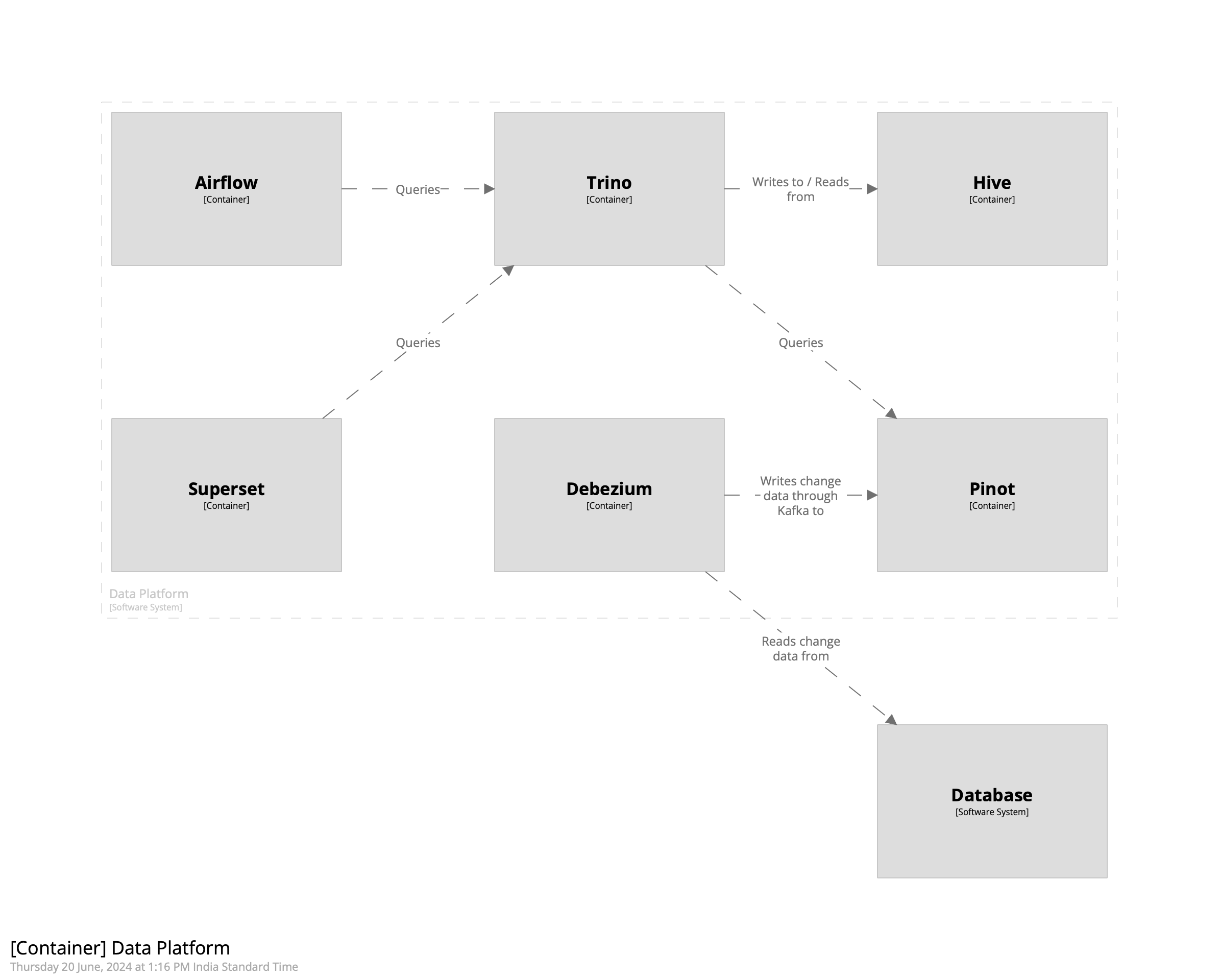
My setup consists of Docker containers for running Pinot, Airflow, Debezium, and Trino. Like in the post on creating a warehouse with Doris, we’ll create a person table in Postgres and replicate it into Kafka. We’ll then ingest it into Pinot using its integrated Kafka consumer. Once that’s done, we’ll use Airflow to transform the data to create a view that makes it easier to work with it. Finally, we can use Superset to create reports. The intent of this post is to create a complete data platform that makes it possible to derive insights from data with minimal latency. The overall architecture looks like the following.
Getting Started
We’ll begin by creating a schema for the person table in Pinot. This will then be used to create a realtime table. Since we want to use Pinot’s upsert capability to maintain the latest record of each row, we’ll ensure that we define the primary key correctly in the schema. In the case of the person table, it is the combination of the id and the customer_id field. The schema looks as follows.
We’ll use the schema to create the realtime table in Pinot. Using ingestionConfig we’ll extract fields out of the Debezium payload and into the columns defined above. This is defined below.
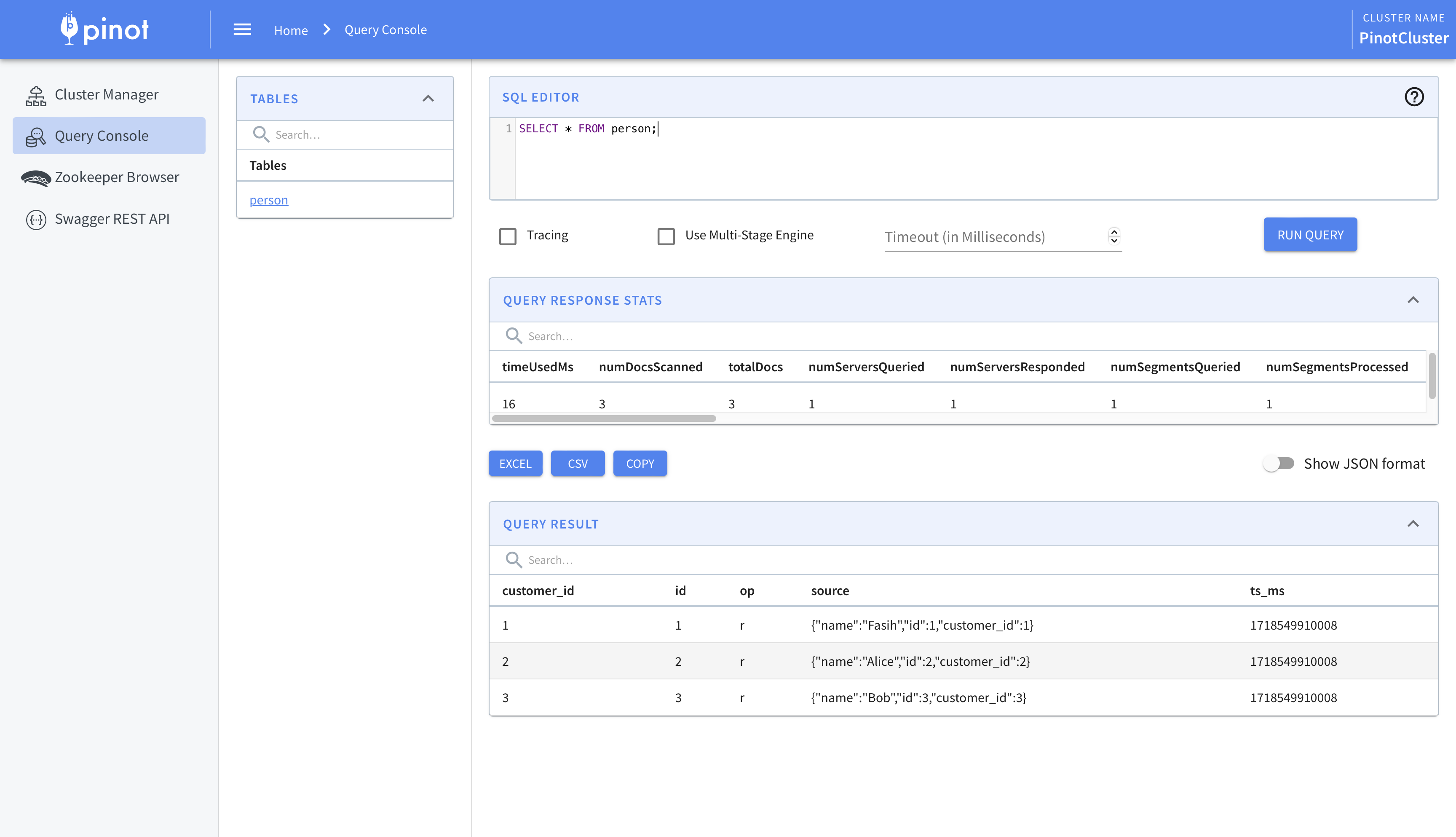
With these steps done, the change data from Debezium will be ingested into Pinot. We can view this using Pinot’s query console.
This is where we begin to integrate Airflow and Trino. While the data has been ingested into Pinot, we’ll use Trino for querying. There are two main reasons for this. One, this allows usto federate queries across multiple sources. Two, Pinot’s SQL capabilities are limited. For example, there is no support, as of writing, for creating views. To circumvent these we’ll create a Hive connector in Trino and use it to query Pinot.
The first step is to connect Trino and Pinot. We’ll do this using the Pinot connector.
1 2 3 4
CREATE CATALOG pinot USING pinot WITH ( "pinot.controller-urls" = 'pinot-controller:9000' );
Next we’ll create the Hive connector. This will allow us to create views, and more importantly materialized views which act as intermediate datasets or final reports, which can be queried by Superset. I’m using AWS Glue instead of Hive so you’ll have to change the configuration accordingly.
We’ll create a schema to store the views and point it to an S3 bucket.
1 2 3 4
CREATE SCHEMA hive.views WITH ( "location" = 's3://your-bucket-name-here/views/' );
We can then create a view on top of the Pinot table using Hive.
1
2
3
4
5
6
CREATE OR REPLACE VIEW hive.views.person AS SELECT id, customer_id, JSON_EXTRACT_SCALAR(source, '$.name') AS name, op FROM pinot.default.person;
Finally, we’ll query the view.
1 2 3 4 5 6 7
trino> SELECT * FROM hive.views.person; id | customer_id | name | op ----+-------------+-------+---- 1 | 1 | Fasih | r 2 | 2 | Alice | r 3 | 3 | Bob | r (3 rows)
While this helps us ingest and query the data, we’ll take this a step further and use Airflow to create the views instead. This allows us to create views which are time-constrained. For example, if we have an order table which contains all the orders placed by the customers, using Airflow allows to create views which are limited to, say, the last one year by adding a WHERE clause.
We’ll use the TrinoOperator that ships with Airflow and use it to create the view. To do this, we’ll create an sql folder under the dags folder and place our query there. We’ll then create the DAG and operator as follows.
1 2 3 4 5 6 7 8 9 10 11 12 13
dag = DAG( dag_id="create_views", catchup=False, schedule="@daily", start_date=pendulum.now("GMT") )
person = TrinoOperator( task_id="person", trino_conn_id="trino", sql="sql/views/person.sql", dag=dag )
Workflow
The kind of workflow this setup enables is the one where the data engineering team is responsible for ingesting the data into Pinot and creating the base views on top of it. The business intelligence / analytics engineering, and data science teams can then use Airflow to create datasets that they need. These can be created as materialized views to speed up reporting or training of machine learning models. Another advantage of this setup is that bringing in older data, say, of the last two years instead of one, is a matter of changing the query of the base view. This avoids complicated backfills and speeds things up significantly.
As an aside, it is possible to use DBT instead of TrinoOperator. It can be used in conjunction with TrinoOperator, too. However, I preferred using the in-built operator to keep the stack simpler.
Cost
Before we conclude, we’ll quickly go over how to keep the cost of the Pinot cluster low while using this setup. In the official documentation it says that data can be seperated by age; older data can be stored in HDDs while the newer data can be stored in SSDs. This allows lowering the cost of the cluster.
An alternative approach is to keep all the data in HDDs and load subsets into Hive for querying. This also allows changing the date range of the views by simply updating the queries. In essence, Pinot becomes the permanent storage for data while Trino and Hive become the intermediate query and storage layer.
That’s it. That’s how we can create a realtime data platform using Pinot, Trino, Debezium, and Airflow.
In the chapter on exponents the authors mention that if a base is raised to both a power and a root, we should calculate the root first and then the power. This works perfectly well. However, reversing the order produces correct results, too. In this post we’ll see why that works using the properties of exponents.
Let’s say we have a base that is raised to power and root . We could write this as . From the properties of exponents, we could rewrite this as . Alternatively, it can be written as . Since multiplication is commutative, we can switch the order of operations and rewrite it as . This means we can calculate the power first and then take the root.
Let’s take a look at a numerical example. Consider . We know that the answer should be equal to . If we were to calculate the root first, we get . If we were to calculate the power first and then take the root, we’d get . As we can see, we get the same result.
Therefore, we can apply the operations in any order.
While reading through the chapter on solving quadratics of a math textbook, I came across a paragraph where the authors mention that factoring quadratics takes a bit of ingenuity, experience, and dumb luck. I spent some time creating an alternative method from the one mentioned in the book which makes factoring quadratics a matter of following a simple set of steps, and removes the element of luck from it. In this post I will review some of the concepts mentioned in the book, and solve through one of the more difficult problems to illustrate my method.
Concepts
Let’s begin by looking at the quadratic . This can be factored as . Multiplying the terms gives us . Comparing this to the coefficients of the the original quadratic gives us , and . For a simple quadratic, we can guess that and . For quadratics where it is not so obvious, we need hints to guide us along the way.
We can get insights into the signs of and by looking at the product and the sum of coefficients of the quadratic. If the product is positive, then they have the same signs. If the product is negative, they have different signs. This makes intuitive sense. In case the product is positive, the sum tells us whether they are both positive or both negative.
We will use this again when we look at the alternative method to factor a quadratic. First, however, we will look at a different type of quadratic where the coefficient of is not 1.
Consider the quadratic . It can be factored as . Multiplying the terms gives us . As in the previously mentioned quadratic, we can get the product and the sum terms by comparing the quadratic with the general form we just derived. Here , and . A small nuance to keep in mind is that if the coefficient of were negative, we’d factor out a to make it positive.
Now we move on to the problem and the method. You’ll find that although the method is tedious, it will remove the element of luck from the process.
Method
Consider the quadratic . Here, , , and . From the guiding hints mentioned in the previous section, we notice that the signs of and are the same; they are either both positive or both negative. We begin the method be defining a function which returns a set of pairs of all the factors of . Therefore, we can write and as follows.
We will now get to the tedious part. We will create combinations of . We pick the first pair of factors of and match it with the first pair of factors of . For the sake of brevity, we will only some of the examples to illustrate the process.
7
7
2
66
476
7
7
-2
-66
-476
7
7
66
2
476
7
7
-66
-2
-476
Notice how we swap the values of and in the columns above. This is because we’re trying to find the product and its value will change depending on what the value of and are. Similarly, we’ll have to swap the values of and ; this is not apparent in the table above because both the values are . We will have to continue on with the table since we we are yet to find a combination of numbers which equals . The table is quite large so we’ll skip the rest of the entries for the sake of brevity and look at the one which gives us the value we’re looking for.
49
1
-22
-6
-316
We can now write our factors as . This gives us or .
That’s it. That’s how we can factor quadratics by creating combinations of the factors of their coefficients.
In a previous blog post we’d seen how to use OpenTelemetry and Parca to instrument two microservcies. Imagine that our architecture has grown and we now have many microservices. For example, there is a microservice that is used to send emails, another which keeps track of user profile information, etc. We’d previously hardcoded the HTTP address of the second microservice to make a call from the first microservice. We could have, in a production environment, added a DNS entry which points to the load balancer and used that instead. However, when there are many microservcies, it becomes cumbersome to add these entries. Furthermore, any new microservice which depends on another microservice now needs to have the address as a part of its configuration. Maintaining a single repository, which can be used to find the microservices and their addresses, becomes difficult to maintain. An easier way to find services is to use service discovery - a dynamic way for one service to find another. In this post we’ll modify the previous architecture and add service discovery using Zookeeper.
Before We Begin
In a nutshell, we’ll use Zookeeper for service registration and discovery. We’ll modify our create_app factory function to make one more function call which registers the service as it starts. The function call creates an ephemeral node in Zookeeper at a specified path and stores the host and port. Any service which needs to find another service looks for it on the same path. We’ll create a small library for all of this which will make things easier.
Getting Started
We’ll begin by creating a simple attr class to represent a service.
1
2
3
4
@define(frozen=True) classService: host: str port: int
We’ll be using the kazoo Python library to interact with Zookeeper. The next step is to create a private variable which will be used to store the Zookeeper client.
1
_zk: KazooClient | None = None
Next we’ll add the function which will be called as a part of the create_app factory function.
In this function we’ll first initialize the connection to Zookeeper and then register our service. We’ll see both of these functions next, starting with the one to init Zookeeper.
The _zk variable is meant to be a singleton. I was unable to find whether this is thread-safe or not but for the sake of this post we’ll assume it is. The start method creates a connection to Zookeeper synchronously and raises an error if no connection could be made in timeout seconds. We also add a listener to respond to changes in the state of a Zookeeper connection. This enables us to respond to scenarios where the connection drops momentarily. Since we’ll be creating ephemeral nodes in Zookeeper, they’ll be removed in the case of a session loss and would need to be recreated. In the listener we recreate the node upon a successful reconnection.
Next we’ll look at the function to register the service.
1 2 3 4 5 6 7 8 9 10 11 12 13 14 15 16 17
def_register_service(): global _zk
service = os.environ.get("SERVICE") host = socket.getfqdn() port = os.environ.get("PORT")
We get the name of the service and the port it is running on as environment variables. The host is retrieved as the fully-qualified domain name of the machine we’re on. Although the example is running on my local machine, it may work on a cloud provider like AWS. We then create a UUID identifier for the service, and a path on which the service will be registered. The information stored on the path is a JSON containing the host and the port of the service. Finally, we create an ephemeral node on the path and store the host and port.
Next we’ll look at the function which handles changes in connection state.
1 2 3
def_state_change_listener(state): if state == KazooState.CONNECTED: _register_service()
We simply re-register the service upon reconnection.
Finally, we’ll look at the function which retrieves an instance of the service from Zookeeper.
1 2 3 4 5 6 7 8 9 10 11 12 13 14 15 16 17 18
defget_service_from_zookeeper(service: str) -> Service | None: global _zk assert _zk
path = f"/providers/{service}" children = _zk.get_children(path)
To get a service we get all the children at the path /providers/SERVICE_NAME. This returns a list of UUIDs, each of which represents an instance of the service. We randomly pick one of these instances and fetch the information associated with it. What we get back is a two-tuple containing the host and port, and an instance of ZStat which we can ignore. We decode and parse the returned information to get an instance of dict. This is then used to return an instance of Service. We can then use this information to make a call to the returned service.
This is all we need to create a small set of utility functions to register and discover services. All we need to do to register the service as a part of the Flask application process is to add a function call in the create_app factory function.
1 2 3 4 5 6 7 8
defcreate_app() -> Flask: ...
# -- Initialize Zookeeper and register the service. init_zookeeper_and_register()
return app
Finally, we’ll retrieve the information about the second service in the first service right before we make the call.
1 2 3 4
defmake_request() -> dict: service = get_service_from_zookeeper(service="second") url = f"http://{service.host}:{service.port}" ...
As an aside, the service will automatically be deregistered once it stops running. This is because we created an ephemeral node in Zookeeper and it only persists as long as the session that created it is alive. When the service stops, the session is disconnected, and the node is removed from Zookeeper.
Rationale
The rationale behind registering and discovering services from Zookeeper is to make it easy to create new services and to find the ones that we need. It’s even more convenient when there is a shared library which contains the code that we saw above. For the sake of simplicity, we’ll assume all our services are written in Python and there is a single library that we need. The library could also contain an enum that represents all the services that are registered with Zookeeper. For example, to make a call to an email microservice, we could have code that looks like the following.
1 2
email_service = Service.EMAIL_SERVICE.value service = get_service_from_zookeeper(service=email_service)
This, in my opinion, is much simpler than adding a DNS entry. The benefits add up over time and result in code that is both readable and maintainable.
In one of the previous posts we saw how we can scale a Python microservice and allow it to connect, theoretically, to an infinite number of databases. The way we did this is by fetching the database connection information at runtime from another microservice using the unique identifier of the customer. This allowed us to scale horizontally to some extent. However, there is still the limitation that the data of the customer may be so large that it would exceed the limit of the database when it is scaled vertically. In this post we’ll look at how to extend the architecture we saw previously and shard the data across servers. We’ll continue to use relational databases and see how we can shard the data using Postgres PARTITION BY.
Before We Begin
The gist of scaling by sharding is to split the table into multiple partitions and let each of these be hosted on a separate host. For the purpose of this post we’ll use a simple setup that consists of four partitions that are spread over two hosts. We’ll use Postgres’ Foreign Data Wrapper (FDW) to connect one instance of Postgres to another instance of Postgres. We’ll store partitions in both these hosts, and create a table which uses these partitions. Querying this table would allow us to query data from all the partitions.
Getting Started
My setup has two instances of Postgres, both of which will host partitions. One of them will also contain the base table which will use these partitions. We’ll begin by logging into the first instance and creating the FDW extension which ships natively with Postgres.
1
CREATE EXTENSION postgres_fdw;
Next, we’ll tell the first instance that there is a second instance of Postgres that we can connect to. Since both of these instances are running as Docker containers, I will use the hostname in the SQL query.
1
CREATE SERVER postgres_5 FOREIGN DATA WRAPPER postgres_fdw OPTIONS (host 'postgres_5', dbname 'postgres');
Next, we’ll create a user mapping. This allows the user of the first instance to log into the second instance as one of its users. We’re simply mapping the postgres user of the first instance to the postgres user of the second instance.
1
CREATEUSER MAPPING FOR postgres SERVER postgres_5 OPTIONS (user'postgres', password 'my-secret-pw');
Next, we’ll create the base table. There are a couple of things to notice. First, we use the PARTITION BY clause to specify that the table is partitioned. Second, there is no primary key on this table. Specifying a primary key prevents us from using foreign tables so we’ll omit them.
1 2 3 4 5 6 7
CREATETABLE person ( id BIGSERIAL NOTNULL, quarter BIGINTNOTNULL, name TEXT NOTNULL, address TEXT NOTNULL, customer_id TEXT NOTNULL ) PARTITIONBY HASH (quarter);
Next, we’ll create two partitions that reside on the first instance. We could, if the data were large enough, host each of these on separate instances. For the purpose of this post, we’ll host them on the same instance.
1 2
CREATETABLE person_0 PARTITIONOF person FORVALUESWITH (MODULUS 4, REMAINDER 0); CREATETABLE person_1 PARTITIONOF person FORVALUESWITH (MODULUS 4, REMAINDER 1);
We’ll now switch to the second instance and create two tables which will host the remaining two partitions.
1 2 3 4 5 6 7 8 9 10 11 12 13 14 15 16
CREATETABLE person_2 ( id BIGSERIAL NOTNULL, quarter BIGINTNOTNULL, name TEXT NOTNULL, address TEXT NOTNULL, customer_id TEXT NOTNULL );
CREATETABLE person_3 ( id BIGSERIAL NOTNULL, quarter BIGINTNOTNULL, name TEXT NOTNULL, address TEXT NOTNULL, customer_id TEXT NOTNULL );
Once this is done, we’ll go back to the first instance and designate these tables as partitions of the base table.
1 2
CREATEFOREIGNTABLE person_2 PARTITIONOF person FORVALUESWITH (MODULUS 4, REMAINDER 2) SERVER postgres_5; CREATEFOREIGNTABLE person_3 PARTITIONOF person FORVALUESWITH (MODULUS 4, REMAINDER 3) SERVER postgres_5;
That’s it. This is all we need to partition data across multiple Postgres hosts. We’ll now run a benchmark to insert data into the table and its partitions.
Once the benchmark is complete, we can query the base table to see that we have 5000 rows.
1
2
3
4
SELECTCOUNT(*) FROM person;
count 5000
What I like about this approach is that it is built using functionality that is native to Postgres - FDW, partitions, and external tables. Additionally, the sharding is transparent to the application; it sees a single Postgres instance.
In one of the previous blog posts I’d written about implementing TSum, a table-summarization algorithm from Google Research. The implementation was written using Javascript and was meant for small datasets that can be summarized within the browser itself. I recently ported the implementation to Dask so that it can be used for larger datasets that consist of many rows. In a nutshell, it lets us summarize a Dask DataFrame and find representative patterns within it. In this post we’ll see how to use the algorithm to summarize a Dask DataFrame, and run benchmarks to see its performance.
Before We Begin
Although the library is designed to be used in production on data stored in a warehouse, it can also be used to summarize CSV or Parquet files. In essence, anything that can be read into a Dask DataFrame can be summarized.
Getting Started
Summarizing data
Imagine that we have customer data stored in a datawarehouse that we’d like to summarize. For example, how would we best describe the customer’s behavior given the data? In essence, we’d like to find patterns within this dataset. In scenarios like these, TSum works well. As an example of data summarization, we’ll use the patient data given in the research paper and pass it to the summarization algorithm.
We’ll begin by adding a function to generate some test data.
This indicates that the patterns that best describe our data are “adult males”, which comprise 50% of the data, followed by “children with low blood pressure”, which comprise 30% of the data. We can verify this by looking at the data returned from the data function, and from the patterns mentioned in the paper.
Running benchmarks
To run the benchmarks, we’ll modify the script and create DataFrames with increasing number of rows. The benchmarks are being run on my local machine which has an Intel i7-8750H, and 16GB of RAM. The script which runs the benchmark is given below.
Let’s start with a question: how do you run database migrations? Depending on the technology you are using, you may choose something like Flyway, Alembic, or some other tool that fits well with your process. My preference is to write and run the migrations as SQL files. I recently released a small library, yoyo-cloud, that allows storing the migrations as files in S3 and then applying them to the database. In this post we will look at the rationale behind the library, and the kind of workflow it enables.
Before We Begin
We’ll start with an example that shows how to run migrations on a Postgres instance. There are a couple of SQL files that I have stored in an S3 bucket — one to create a table, and another to insert a row after the table is created. The bucket is public so you should be able to run the snippet below.
1 2 3 4 5 6 7 8 9 10
from yoyo import get_backend from yoyo_cloud import read_s3_migrations
if __name__ == "__main__": migrations = read_s3_migrations(paths=["s3://yoyo-migrations/"]) backend = get_backend(f"postgresql://postgres:my-secret-pw@localhost:5432/postgres")
with backend.lock(): # -- Apply any outstanding migrations backend.apply_migrations(backend.to_apply(migrations))
As you can see from the imports, we use a combination of the original library, yoyo, which provides a helper function to connect to the database, and the new library, yoyo_cloud, which provides a helper function to read the migrations that are stored in S3.
The read_s3_migrations function reads the files that are stored in S3. It takes as input a list of S3 paths that point to directories where the files are stored. This function is similar in interface to the read_migrations function in yoyo which reads migrations from a directory on the file system except that it reads from S3; the value returned is the same — a list of migrations.
Finally, we apply the migrations to the Postgres instance. The purpose of this example was to demonstrate the simplicity with which migrations stored in S3 can be applied to a database using yoyo_cloud. We will now look at the rationale behind the library in the next section.
Rationale
The rationale behind the library, as mentioned at the start of this post, is to store SQL migrations as files and apply them one-by-one. Additionally, it allows migrating multiple similar databases easily. In the previous post on scaling Python microservices we’d seen how a Flask microservice can dynamically connect to multiple databases. If we want to apply a migration, say adding a new column to a table, we’d want it to be applied to all the databases that the service connects to. Using yoyo_cloud we can read the migration from S3, and apply to every table. Since the migrations are idempotent, we can safely reapply the previous migrations.
Workflow
Let’s assume we’d like to create an automation which applies database migrations. We’ll assume we have two environments — stage, and prod. Whenever a migration is to be released to production, it is first tested in the dev environment, and then committed to version control to be applied to the staging environment. These could be stored as a part of the same repository or in a separate repository that contains only migrations. Let’s assume it is the latter. We could have a directory structure as follows.
The automation could then apply these migrations to the relevant environment of the service. An additional benefit of this approach is that it makes setting up new environments easier because the migrations can applied to a new database. Additionally, committing migrations to version control, as opposed to running them in an adhoc manner, allows keeping track of when the migration was introduced, why, and by whom.
Conclusion
That’s it. That’s how we can apply migrations stored in S3 using yoyo_cloud. If you’re using it, or considering using it, please leave a comment.
In one of the previous posts we saw how to set up a Python microservice. This post is a continuation and shows how to scale it. Specifically, we’ll look at handling larger volumes of data by sharding it across databases. We’ll shard based on the customer (or tenant, or user, etc.) making the request, and route it to the right database. While load tests on my local machine show promise, the pattern outlined is far from production-ready.
Before We Begin
We’ll assume that we’d like to create a service that can handle growing volume of data. To accommodate this we’d like to shard the data across databases based on the user making the request. For the sake of simplicity we’ll assume that the customer is a user of a SaaS platform. The customers are heterogenous in their volume of data — some small, some large, some so large that they require their own dedicated database.
We’ll develop a library, and a sharding microservice. Everything outlined in this post is very specific to the Python ecosystem and the libraries chosen but I am hopeful that the ideas can be translated to a language of your choice. We’ll use Flask and Peewee to do the routing and create a pattern that allows transitioning from a single database to multiple databases.
The setup is fully Dockerized and consists of three Postgres databases, a sharding service, and an api service.
Getting Started
In a nutshell, we’d like to look at a header in the request and decide which database to connect to. This needs to happen as soon as the request is received. Flask makes this easy by allowing us to execute functions before and after receiving a request and we’ll leverage them to do the routing.
Library
We’ll begin by creating a library that allows connecting to the right database.
An instance of Shard is responsible for connecting to the right database depending on how it is configured. In “standalone” mode, it connects to a single database for all customers. This is helpful when creating the microservice for the first time. In “api” mode it makes a request to the sharding microservice. This is helpful when we’d like to scale the service. The API returns the credentials for the appropriate database depending on the identifier passed to it. The identifier_field is a column which must be present in all tables. For example, every table must have a “customer_id” column.
We’ll add a helper function to create an instance of the Shard. This makes it easy to transition from standalone to api mode by simply setting a few environment variables.
api = Blueprint("api", __name__) api.before_app_request(_before_request) api.after_app_request(_after_request)
We’re creating an instance of Shard and using it to retrieve the appropriate database. This is then stored in the per-request global g. This lets us use the same database throughout the context of the request. Finally, we register the before and after hooks.
We’ll now add functions to the library which allow saving and retrieving the data using the database stored in g.
1 2 3 4 5 6 7 8 9 10 11
defsave_with_db( instance: Model, db: Database, force_insert: bool = False, ): identifier_field = os.environ.get(EnvironmentVariables.SHARDING_IDENTIFIER_FIELD) identifier = getattr(instance, identifier_field) assert identifier, "identifier field is not set on the instance"
with db.bind_ctx(models=[instance.__class__]): instance.save(force_insert=force_insert)
What allows us to switch the database at runtime is the bind_ctx method of the Peewee Database instance. This temporarily binds the model to the database that was retrieved using the Shard. In essence, we’re storing and retrieving the data from the right database.
Next we’ll add a simple Peewee model that represents a person.
1 2 3 4 5 6 7 8
classPerson(Model): classMeta: model_metadata_class = ThreadSafeDatabaseMetadata id = BigAutoField(primary_key=True) name = TextField() address = TextField() customer_id = TextField()
We’ll add an endpoint which will let us save a row with some randomly generated data.
Here we’re selecting the right database depending on the customer making the request. For the sake of this demo the information is mostly static but in a production scenario this would come from a meta database that the sharding service connects to.
Databases
We’ll now create tables in each of the three databases.
1 2 3 4 5 6
CREATETABLE person ( id BIGSERIAL PRIMARY KEY, name TEXT NOTNULL, address TEXT NOTNULL, customer_id TEXT NOTNULL );
Testing
We’ll add a small script which uses Apache Bench to send requests for three different customers.
We’ll now connect to one of the databases and check the data. I’m connecting to the third instance of Postgres which should have data for the customer with ID “3”. We’ll first check the count of the rows to see that all 1000 rows are present, and then check the customer ID to ensure that requests are properly routed in a multithreaded environment.
1
SELECTCOUNT(*) FROM person;
This returns the following:
1 2
count 1000
We’ll now check for the customer ID stored in the database.
1
SELECTDISTINCT customer_id FROM person;
This returns the following:
1 2
customer_id 3
Conclusion
That’s it. That’s how we can connect a Flask service to multiple databases dynamically.
In the previous post we saw how to create Python microservices. It’s likely that these microservices will share code. For example libraries for logging, accessing the database, etc. In this post we’ll see how to create and host Python packages.
Before We Begin
The setup is intentionally chosen for simplicity. We’ll separate the common code into a repository of its own, and use Poetry to package it. We’ll deploy it to S3, and use dumb-pypi to generate a static site which can be used to list the hosted packages.
The setup can be expanded to accommodate larger organizations with more teams, but it is primarily intended for smaller organizations with fewer teams that need to ramp up quickly. The main idea behind package distribution for Python is to arrange the files in a particular directory structure that can be accessed by a web server. While I am utilizing S3, you are free to use any comparable technology. You may even host everything on virtual machines (VMs) that are placed behind a load balancer.
Getting Started
Let’s start with a package called “common” which contains the OTel code we saw previously. In essence, we’ve simply copied the contents of package over into a new repository. Next we’ll intialize a Poetry project and enter the relevant information interactively.
1
poetry init --name="common" --description="A collection of utilities" --python="^3.12"
Next we’ll add the relevant dependencies with Poetry. The first three are for the common code, and the fourth is for generating static pages.
There’s a lot going on in the script. First we build the package using Poetry on line #7. The output contains the name of the zip file and we extract that into a variable. This is then stored into a file on line #8 and will be used by dumb-pypi to generate the static files. We sort and deduplicate the packages on line #9. On line #12 we store copy the package to S3. On line #15 we generate the static files into a folder named index which we then copy to S3 on line #21. On line #24 we open the documentation in the browser.
The S3 bucket contains a directory structure as mentioned in the Python packaging docs.[1]
Before we run the script, however, we will have to configure the S3 bucket to be publicly accessible. We do so by enabling it to serve static content, and adding a policy which enables access to the content. The policy is given below.
We can now test the installation of the package with both Poetry and Pip. We will do this in a different Poetry project so that the install does not conflict with the existing “common” package.
1 2 3 4 5 6 7 8 9 10 11 12 13
pip install --extra-index-url https://selfhostedpackages.s3.us-west-2.amazonaws.com/packages/devtools/ common
Looking in indexes: https://pypi.org/simple, https://selfhostedpackages.s3.us-west-2.amazonaws.com/packages/devtools/ Collecting common Using cached common-0.1.2.tar.gz (3.5 kB) Preparing metadata (setup.py) ... done Building wheels for collected packages: common Building wheel for common (setup.py) ... done Created wheel for common: filename=common-0.1.2-py3-none-any.whl size=3708 sha256=51d2f21c15829e49375762f5ca246d7f0e4d0bc82c425b25b5e77fcc83e97eae Stored in directory: /home/fasih/.cache/pip/wheels/12/f4/3f/8982873f5bfad3134251f605011de0c35f93d64b78cb07e3b8 Successfully built common Installing collected packages: common Successfully installed common-0.1.2
Notice how we added the location an extra index using --extra-index-url. The URL points to the devtools directory in the bucket which is the root directory for the packages created by the “devtools” team. The subdirectories follow the layout mentioned previously.
Next we’ll try the same with Poetry after uninstalling the package using pip. First, we’ll check how Poetry allows us to do it.
1 2 3
poetry add --help ... A url (https://example.com/packages/my-package-0.1.0.tar.gz)
Let’s go ahead and add the package in that format.
We can verify that the package was installed successfully by importing it in a Python shell.
1 2 3 4
Python 3.12.0 | packaged by Anaconda, Inc. | (main, Oct 22023, 17:29:18) [GCC 11.2.0] on linux Type"help", "copyright", "credits"or"license"for more information. >>> from common import create_histogram >>>
Conclusion
That’s it. That’s how we can host our own Python packages using S3. Note that this is a setup to get started quickly. If you’re looking for a more matured setup, please take a look at the devpi project.[2]The code is available on Github.
In my tenure as an engineer working for early-to-mid stage startups, I’ve noticed that the first iteration of the product is usually a monolith; all of the code is written in a monorepo, and the tooling, and processes are created to support it. While this helps to ship the product quick and early, it becomes difficult to scale both in terms of software systems, and teams which write code. For example, if multiple teams are creating features then merging the code becomes a bottleneck since all the code is committed to the same repository. Additionally, all of the changes being made to the code that is shared among multiple teams needs to be backward compatible, and any breaking change needs to be communicated to the relevant teams. All of this can slow down the subsequent releases.
As the startup grows, and the multiple features become products of their own, it may be required to separate the monolith into microservices. This requires a change in how systems are designed, and deployed. For example, we’d now need to trace an API request across multiple services. While many teams moving from monoliths to microservices think of them as code that is written in separate repositories, and deployed independently, they’re actually smaller subsystems of the larger software.
This post is my opinion on how Python microservices can be created. While we’ll see libraries and tools used from the Python ecosystem, the ideas discussed in the following sections can be applied to the language of your choice. We’ll create a couple of microservices, and see how we can add logging, tracing, metrics, and profiling to them. The goal is to develop a blueprint that can be used to create microservices.
Before We Begin
We’ll look at two key parts of creating a microservice: telemetry, and profiling. Telemetry includes collecting logs, and metrics. Profiling includes analysing the CPU, memory, IO, etc. Both of these put together give us the complete picture of how the microservice is performing. We’ll use OpenTelemetry and Parca for telemetry, and profiling respectively. A detailed introduction to both of these projects is beyond the scope of this post and you’re encouraged to read the relevant documentation.
Briefly, we will use a combination of zero-code and code-based instrumentation offered by OTel. The zero-code instrumentaion is helpful as it adds instrumentation to the libraries that we are using. If we’d like to instrument our code, we’ll have to use code-based instrumentaion and add it to the source ourselves.
Finally, the setup consists of two Flask apps, and Parca Agent running on the machine; everything else runs as Docker containers. We’ll run an OTel Collector exporter to collect the metrics and logs emitted from OpenTelemetry, Jaeger to display the distributed trace, and Parca Server for continuous profiling.[1]
Getting Started
For the sake of brevity, we will only look at parts of the code that are necessary for the post and will exclude all the scaffolding. The complete code is available in the repository mentioned at the end.
Microservices
We’ll begin by looking at how the microservices work. The two microservices are called “first” and “second”. The first microservice receives an API call, sleeps for duration, and makes an API call to the second. The second receives the API call and makes an API call to the /delay endpoint of HTTPBin. We are trying to mimic a real-world scenario by adding some delay, and a slow API call.
The code for the first endpoint is given below.
1 2 3 4
@api.post("/") defpost() -> dict: time.sleep(random.random()) return make_request() # Makes a call to second
The code for the second endpoint is given below.
1 2 3
@api.post("/") defpost() -> dict: return make_request() # Makes a call to HTTPBin
We can test the two endpoints by running the Flask apps and then making a call to the first.
1
curl -s -XPOST localhost:5000 | jq .
Adding automatic instrumentation
We’ll now begin by adding zero-code instrumentation to both of these microservices. The first step is to install the packages.
This installs the API, SDK, opentelemetry-bootstrap, and opentelemetry-instrument. We’ll now use opentelemetry-bootstrap to install the instrumentation libraries for the libraries that we have installed. It does so by reading the list of libraries installed, and fetching the corresponding instrumentation library, if applicable.
1
opentelemetry-bootstrap -a install
Finally, we’ll add two bash scripts to run the apps with OTel enabled. The script for the first service is given below and the one for the second service looks similiar.
We’ll then send requests to the first service using curl and observe the traces of the two services. Specifically, we’re looking for how OTel does distributed tracing.
1
for i in `seq 1 10`; do curl -s -XPOST localhost:5000 > /dev/null; done
One of the trace generated by the first service is the following.
The context contains the trace_id which is the ID that will be used to trace the request across services. It also contains span_id which represents the current unit of work and that is the request received by the service. The parent_id is null which means that this is the root span; it represents the entry of the request in the mesh of services. The attributes are key-value pairs and they show that the request was received from curl on the / endpoint, and that it returned a 200 response. More detailed information on the structure of the trace can be found in the OTel documentation.[2]
To trace the request across services, OTel propagates some contextual information.[3] This allows linking the spans in a downstream service with an upstream service. In our case, the request received by the second service will be associated with the first. This is done by setting the parent_id of one of the spans in the second service to the span_id of the first service. In essence we’re creating a hierarchy. Let’s look at an example.
Here’s a span from the first service. Notice that it’s parent_id is set to a value to inidicate that it is not a root span. The attributes indicate that a request was made to http://localhost:6000/ and that is the endpoint of the second service.
If we were to depict the flow of request as a tree we get the following.
1 2
Root Span - first service calls the second
Let us now look at a span from the second service. It has the same trace_id as the one from the first, and the parent_id is the span_id of the span we saw previously. The attributes indicate that this span represents the request that was made from the first service to the second.
We can see that the parent_id is the span_id of the previous span, and the attributes indicate that a call was made to HttpBin. Notice that throughout this flow the trace_id has remained the same. We can now look at the final tree to see the flow of requests. Distributed tracing backends like Jaeger provide a visual representation of this flow.
1 2 3 4
Root Span - first service calls the second - second service receives the request - second service calls HttpBin
So far we’ve sent the traces to the console which is helpful for development. We’ll now look at how we can send the traces to the OpenTelemetry Collector[4], and from there to appropriate backends.
OTel Collector
Telemetry data is received, processed, and exported via the OTel Collector. It may receive logs and export them to any vendor of your choosing, or it can receive traces and export them to Jaeger. As a result, the services can submit telemetry data to the collector, which will forward it to the relevant backends. This enables the codebase to be instrumented with merely OTel, while a combination of open-source and proprietary backends can be used to process the telemetry data.
We only need to change the command in the bash script that launches the services in order to transmit the data to the Collector. Notice that we have included OTLP as an export option for all of our telemetry data. In a similar vein, we supply the endpoints — which leads to the collector(s) — to whom the data will be transferred. While all metrics can be specified as a single collection endpoint, the example below demonstrates how to send each type of data separately, allowing the collector(s) to be scaled independently.[5]
We need to configure the collector(s) for it to be able to recieve, transform, and export the data. This is done through a YAML file. We specify the receivers, processors, and exporters for each type of telemetry data.[6] For the sake of this post, we’ll modify the example given in the official OTel documentation slightly and send the traces to Jaeger.
If we look at the pipeline, at the bottom of the YAML file, which processes the traces, we’ll see that we receive them in the OTLP format, batch them[7], and send them to Jaeger. Similarly, we could export the logs to a vendor of our choosing, or to a self-hosted solution like OpenSearch.
Finally, we’ll look at adding instrumention using code to the services.
Code-based Intrumentation
When we put a service into production, we will need more than just the basic monitoring that OTel provides. For instance, we might want to monitor how much time it takes for a specific part of the code to run. We can use the OTel SDK for situations like these. When we did the bootstrap step, the OTel API and SDK were installed for us. We can check this by looking for them in the list of installed packages.
We’ll begin by couting the number of requests that are received by the first service. To do this, we’ll first need to obtain a MeterProvider[8]. From this we will create a Meter, and then Metric Instruments. The instruments represent the actual metric that we want to track. For example, a counter.
The common package in our repository contains code to configure a MeterProvider, obtain a counter, and to incremenet it. For the sake of brevity we will only look at the change to the endpoint of the first service.
1 2 3 4 5 6 7 8 9 10 11 12
_counter = create_counter( name="first.request.count", unit="1", description="Counts the number of requests received by the service" )
@api.post("/") defpost() -> dict: increment_counter(counter=_counter) time.sleep(random.random()) return make_request() # Makes a call to second
We are now keeping track of how many times we call the API. If we check the numbers in the console, we will find this. The value shows how many times we used curl to make requests. It is currently at 10.
1 2 3 4 5 6 7 8 9 10 11 12 13 14 15 16 17 18 19
{ "name":"first.request.count", "description":"Counts the number of requests received by the service", "unit":"1", "data":{ "data_points":[ { "attributes":{ "env":"dev" }, "start_time_unix_nano":1710928263740358000, "time_unix_nano":1710928319927995000, "value":10 } ], "aggregation_temporality":2, "is_monotonic":true } }
We can create different instruments, too. Let us now use a histogram to track the time taken by HTTPBin.
1 2 3 4 5 6 7 8 9 10 11
_histogram = create_histogram( name="httpbin.latency", unit="1.0", description="Track the time taken by the /delay endpoint." )
@api.post("/") defpost() -> dict: with timed(_histogram): return make_request() # Makes a call to HTTPBin
Like with the previous metric, we can see it logged to the console. The output for a hisogram is sufficiently large and has been excluded for brevity.
With this we conclude how to add telemetry, both automatic and manual, using OTel. Before we move on to profiling, I’d like to point out a few things I noticed when using the Python SDK for OTel. One, there is only the console exporter for metrics and traces. I’d assume we’d need an OTLP exporter to be able to send these to the collector. Two, the logs SDK is still under development.[9] Nonetheless, OTel is a great way to add instrumentation to the services.
Profiling
Telemetry helps us observe how our program is performing by looking at logs, metrics, and traces. Another way to observe the program is by profiling it. This helps us understand how resources like memory, IO, CPU, etc. are being used. In this section we will look at how to profile our microservices using Parca. Specifically, we will profile the CPU usage.[10]
To see our service’s CPU usage over time, we will add a new endpoint which computes Fibonacci numbers. Since this is a CPU-intensive operation, it will be captured visibly in the trace. We’ll add the following endpoint to the first microservice.
1 2 3 4 5 6 7 8 9 10 11 12 13 14 15
@api.get("/<int:n>") defget(n: int) -> dict:
def_one(n: int): return _two(n=n)
def_two(n: int): return _fibo(n=n)
def_fibo(n: int): for i inrange(1, n - 1): fibo(i) return fibo(n=n)
return {"fibonacci": _one(n=n)}
Notice that the returned value is generated from calling _one. This function then calls _two which eventually calls _fibo. The reason it is written this way is to have them show up in the profile.
Next we will download the Parca Agent. This is an always-on profiler which reads the stack traces of programs in both user-space and kernel-space.
1 2
RUN wget -O parca-agent https://github.com/parca-dev/parca-agent/releases/download/v0.30.0/parca-agent_0.30.0_`uname -s`_`uname -m` RUN chmod +x parca-agent
We’ll also add a small script which sends random requests to the endpoint.
1 2 3 4 5 6 7 8
import requests import random
if __name__ == "__main__": for _ inrange(1, int(1e10)): n = random.randint(1, 31) response = requests.get(f"http://localhost:5000/{n}") response.raise_for_status()
We’ll now run the agent and the services. The Parca Server which receives the profiles and displays them is part of the Docker compose file. The agent will run on the machine and send the profiles to the server.
Finally, we’ll send requests to the endpoint and wait for the profiler to generate profiling data. This will be visible on localhost:7071. To query the first microservice we will need its pid, and this can be obtained by grepping for it.
We can now query Parca and look at the profiles. The benefit of profiling is to look at how the program is performing over time. We’ll compare two profiles along side each other. Notice how we’ve used the PID to filter the profiles.
Similarly, we can look at the stack trace.
Towards the middle of the image we’ll see the call stack calling the private functions _one, _two, and _fib. In the cumulative diff column[11] we see a +10.05s. This means that between the two timeframes, the stacktrace has been running 10.05s longer; we’ve gotten slower with time. This can be confirmed by switching to the icicle graph which indicates the same.
That’s it. We’ve added profiling to our service.
Conclusion
We saw how we can add telemetry using OTel, and profiling using Parca. Both of these are great ways to observe a service in production. However, as of writing, both of these projects are in their early stages as can be seen from functionality that is yet to be developed. For example, OTel’s Python SDK is yet to add support for logging, and Parca only supports CPU profiling. Despite this, they’re both worth following as they let us add observability to our services without much effort.
In one of my previous blog posts I had written about creating software architecture as code. The primary motivation behind it was to commit the architecture to version control, and keep it close to the source code. The added benefit, that perhaps remained implicit, is that architecture reviews can now happen as a part of the PR review. In the same spirit, I’d also like to keep the documentation close to the source code, and make documentation review a part of the PR review process. This post is about setting up Sphinx documentaion for a Flask microservice. Although everything mentioned in this post is Python-specific, the ideas can hopefully be applied to any language and framework of your choice.
Getting Started
We’ll build a simple Flask microservice. It receives an HTTP request, conducts some processing, and then invokes another microservice. For the purpose of this post, the processing is simply time.sleep, while the other microservice is HTTPBin. We’ll then document our code and render it with Sphinx. This example, while contrived, is analogous to many real-world software projects in which numerous packages within the codebase are used in conjunction to express business logic. The goal of documentation, therefore, is to provide context to anyone working with the source. We will include documentation that gives a broad overview of the project, and covers each package in detail.
HttpBin
We’ll begin by adding classes which will let us make requests to HTTPBin.
An object of HttpBinPost class is a representation of a POST request to HTTPBin, and can include query params, and a JSON body as a part of the request. As you’d have noticed, there is no documentation in the code.
We’ll now add a blueprint which will accept incoming requests, and then make calls to HttpBin.
The httpbin blueprint configures a /post endpoint. We send some query parameters and a json body along with the POST request, and the response is returned directly to the caller. Finally, we make a curl call to the endpoint.
1
curl -s -XPOST localhost:5000/post | jq .
To summarize, we have a codebase that includes a package for making requests to HttpBin, as well as an API endpoint that makes the request using this package. We will now look at Sphinx and how to document the codebase.
Sphinx
Sphinx is a documentation generator that we’ll use to generate HTML files from a directory of reStructuredText files. We’ll also use the autodoc extension to generate documentaion from docstrings of Python classes and functions. The first step, however, is to install Sphinx. We’ll do so by using pip.
1
pip install sphinx
We’ll now begin configuring Sphinx. We’ll navigate to the docs directory, and run the sphinx-quickstart script that will run the interactive setup. While following along the setup, we’ll make sure to separate the build and source directories.
1 2
cd docs/ sphinx-quickstart
The source directory will contain the configuration file along with the rst files. The build directory will contain the HTML files that are generated when we build the documentation from the source directory. Let’s take a quick look at the generated files and directories with tree.
We will update conf.py and add our repository to sys.path. This is required by the autodoc extension as it imports modules to be documented. We’ll add the following lines to the bottom of the file. You will have to update the path appropriately.
1 2 3 4 5 6
# -- Add our repository to sys.path from pathlib import Path import sys
We’ll now generate documentation by running the sphinx-build command manually. Later we’ll write a small bash script to automate the process of regenerating the documentation.
1 2
sphinx-build source/ build/html/ open build/html/index.html
We’ll get the following HTML page after rendering index.rst. It is extremely basic, and we will add to it to give an overview of the codebase.
We’ll update the conf.py file and enable a couple of extensions by adding them to the extensions array.
The two extensions we’ve added allow us to include docstrings as a part of the documentation. For the sake of this post, we’ll add lorem ipsum to the HttpBinPost class.
1 2 3 4 5 6 7 8 9 10 11 12
@dc.dataclass classHttpBinPost(_HttpBinRequest): """ Lorem ipsum dolor sit amet, consectetur adipiscing elit. Fusce laoreet lectus neque, in congue purus dapibus et. Sed eros elit, luctus ac ante eget, fermentum imperdiet urna. Integer rutrum leo sed quam faucibus rutrum. Suspendisse nulla diam, rhoncus id nisi et, aliquet auctor risus. In pellentesque, orci quis molestie dignissim, dui massa posuere lorem, ut suscipit orci libero quis sem. Etiam ullamcorper turpis at tempus semper. Nunc odio massa, feugiat quis sem nec, hendrerit pretium ex. Integer varius volutpat interdum. """
We’ll now create a new rst file called httpbin.rst in the source directory. This will contain the overview of the HTTPBin module, and a couple of directives to include the module, and the HttpBinPost class as a part of the documentation.
1 2 3 4 5 6 7 8 9 10 11 12 13 14
HttpBin Module ==============
Lorem ipsum dolor sit amet, consectetur adipiscing elit. Fusce laoreet lectus neque, in congue purus dapibus et. Sed eros elit, luctus ac ante eget, fermentum imperdiet urna. Integer rutrum leo sed quam faucibus rutrum. Suspendisse nulla diam, rhoncus id nisi et, aliquet auctor risus. In pellentesque, orci quis molestie dignissim, dui massa posuere lorem, ut suscipit orci libero quis sem. Etiam ullamcorper turpis at tempus semper. Nunc odio massa, feugiat quis sem nec, hendrerit pretium ex. Integer varius volutpat interdum.
Finally, we’ll update the index.rst file. This is where we’ll provide the overview of the codebase, and link the httpbin.rst file.
1
2
3
4
5
6
7
8
9
10
11
12
13
14
15
16
17
18
Welcome to Sphinx's documentation! ================================== Lorem ipsum dolor sit amet, consectetur adipiscing elit. Fusce laoreet lectus neque, in congue purus dapibus et. Sed eros elit, luctus ac ante eget, fermentum imperdiet urna. Integer rutrum leo sed quam faucibus rutrum. Suspendisse nulla diam, rhoncus id nisi et, aliquet auctor risus. In pellentesque, orci quis molestie dignissim, dui massa posuere lorem, ut suscipit orci libero quis sem. Etiam ullamcorper turpis at tempus semper. Nunc odio massa, feugiat quis sem nec, hendrerit pretium ex. Integer varius volutpat interdum.
.. toctree:: :maxdepth: 2 :caption: Contents:
httpbin.rst
...
The generated documentation now has an overview on the index page, and a link to the HttpBin module. When we click the link to the module, we’ll see that the overview, as well as the docstring of the HttpBinPost class, are included in the documentation. Screenshots of both of these pages are provided below.
We’ll now add a small bash script, called docs.sh, to regenerate the documentation for the codebase, and place it at the root of the codebase.
1
2
3
4
#!/bin/bash

sphinx-build docs/source/ docs/build/html/
open docs/build/html/index.html
Conclusion
This post is a basic introduction to using Sphinx to generate documentation. Keeping the documentation within the repository allows keeping the context close to the source. Combining this post with the previous post on architecture as code, we can keep most of the context of a repository within itself. I find this to be more helpful than using Confluence or Notion. Finally, all of the code for this post is available as a GitHub repository.
In the footnote of my previous essay, titled ‘War, Peace, and Everything in Between’, I wrote about being able to empirically measure how much at peace a country is. I also mentioned that I’d like to write an essay titled ‘Peace, Precisely’ which would have more mathematical rigor. I spent quite some time thinking about it, and in the interim, I am going to write the current essay and call it ‘Peace, Somewhat Precisely’. The premise of this essay is to step in the direction of the final essay by laying a foundation which can perhaps be reused later.
We shall try to come up with a value which defines how peaceful the world, as a whole, is at a given moment in time.
In my essay I mentioned that we can define interactions between two nations that can help us measure, empirically, how much peace there is between them. For example, the amount of trade and commerce among them can be used as an indicator of peace between them. In theory, we can have many such interactions that together help us measure the peace between the two nations. Mathematically, let’s call this a function . The input to this function are all the interactions among the two nations, and the output is a value between 0 and 1, inclusive that indicates the amount of peace. We shall denote this value as . We, therefore, have .
We can now model the nations of the world, and the relationships between them as a weighted, undirected graph. If a nation has an interaction with another nation, there shall be an edge between them. The weight of the edge shall be the value between the two nations. We’ll introduce one more value, , for serenity, which is a measure of the amount of peace within a nation’s borders, and takes on values between 0 and 1, inclusive. We can define similar interactions which can help us measure the peace within a nation. Let’s define a function such that .
Combining the two above, the amount of peace that a nation has is a combination of peace within, and outside its borders. We can, therefore, define a function which combines the value of and . We now have , and can generate a set of -values for all the nations of the world. The -value, mentioned at the begining of the essay, can now be computed from the set of -values. For example, as a median of the set of values.
This is how we can measure the amount of peace in the world. Hypothetically. :P