In the previous post we saw how we can use Airflow to create datasets on top of the data that’s stored in Pinot. Once a dataset is created, we may need to present it as a report or a dashboard. In this post we’ll look at how to use Superset to create visualizations on top of the datasets that we’ve created. We’ll create a dashboard to display the daily change in the number of orders placed each day.
Getting started
In an earlier post I’d written about how to run Superset locally. In a nutshell, running Superset using Docker compose requires cloning the repository and checking out the version of the project you’d like to run. In that post I’d also shown how to install additional packages so that we can add the ability to connect to another database. For the sake of brevity, I’ll simply repeat the steps here and refer you to the earlier post for more details.
Let’s start by cloning the repo and navigating to it.
1 | git clone https://github.com/apache/superset.git --depth 1 |
Next, we’ll checkout the git repository to a specific tag so that we can build from it.
1 | git checkout 4.1.1 |
Next, we’ll add the Python package which will let us connect to Pinot.
1 | echo "pinotdb" >> ./docker/requirements-local.txt |
Finally, we’ll bring up the containers for this specific tag.
1 | TAG=4.1.1 docker-compose -f docker-compose-non-dev.yml up -d |
This will build the Docker images for Superset and run them as containers. Once the containers are running, Superset will be available on http://localhost:8088. You can use admin as both the username and password to log in. Now that we’re logged in, we can begin creating charts and dashboards. Let’s start by connecting to Trino.
Click on “Settings” on the top-right corner. Click on “Database Connections”. Finally, click on “+ Database”. You should see the following screen pop up.
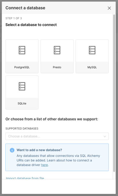
From the supported databases, select “Trino”. Once selected, you’ll be asked to enter the connection string to connect to it. Since the Superset Docker containers are running seperately from the ones where Trino is running, we’ll have to use the IP address of the local machine to make the connection between Superset and Trino. Depending on your operating system, the steps may vary. Go ahead and find the IP address of your machine. Let’s continue with my machine. We’ll have to enter the connection string that SQLAlchemy expects. It looks as follows.
1 | trino://admin:@192.168.0.103:9080 |
Notice how we’ve specified admin as the user and a blank password. I’m also specifying the port since I’ve mapped Trino’s port 8080 to 9080 locally. Once we’ve entered the details, we can click on “Test Connection” to make sure we’re able to connect. Finally, if the connection succeeds, we’ll click on “Connect” to save the connection. We can now proceed to creating charts and dashboards.
Click on “Dashboards” on the top-left and then click on “+ Dashboard”. This will create a new draft dashboard in which we’ll visualize datasets. Change its name to “Orders and click “Save”. You should see a screen similar to the one shown below.
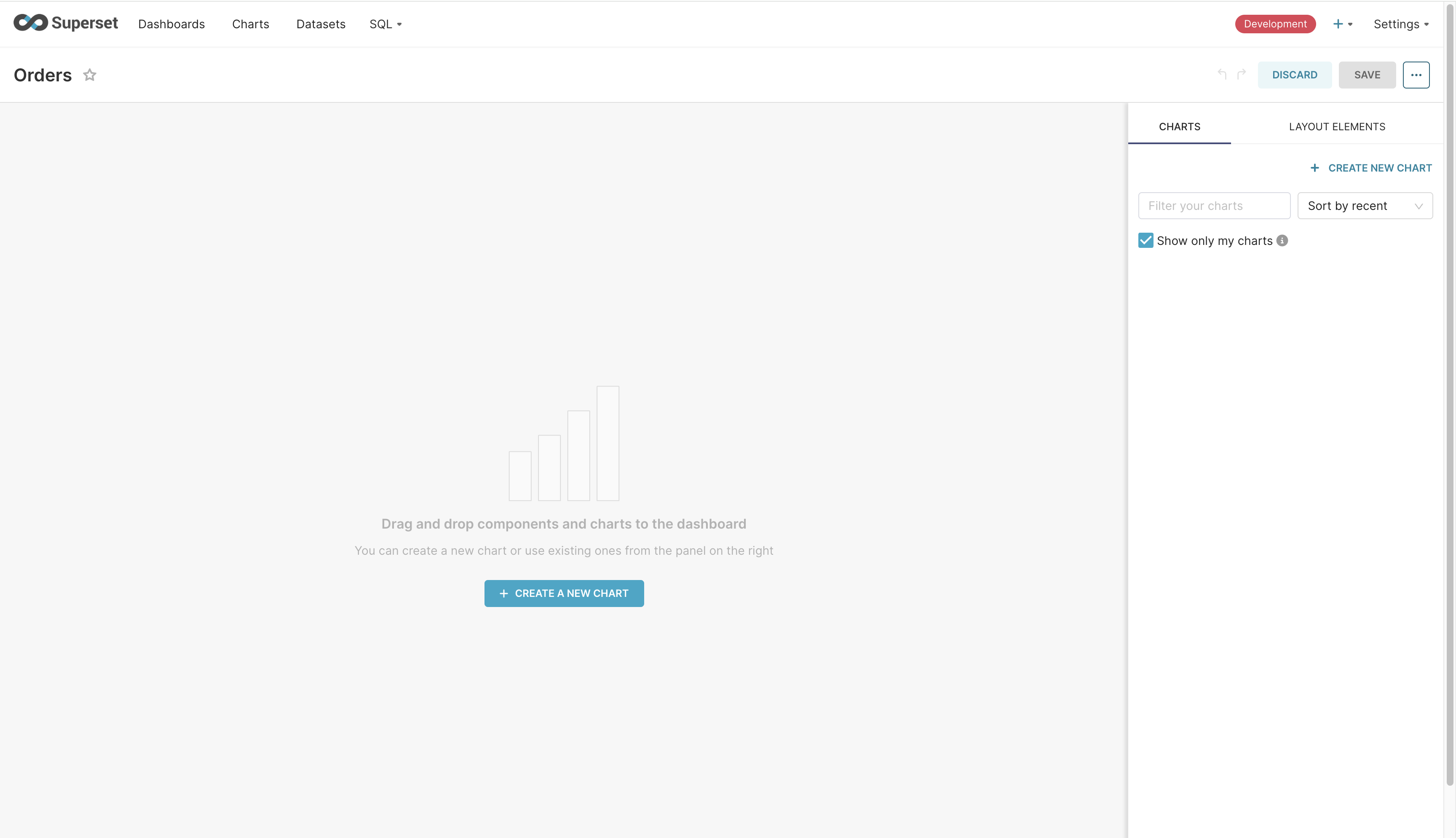
Click on “Create a new chart” button in the middle of the screen. From there, click on “Add a dataset”. Every chart needs to be associated with a dataset. We’ll create them based on the ones we’ve stored in Trino. You should see the following screen.
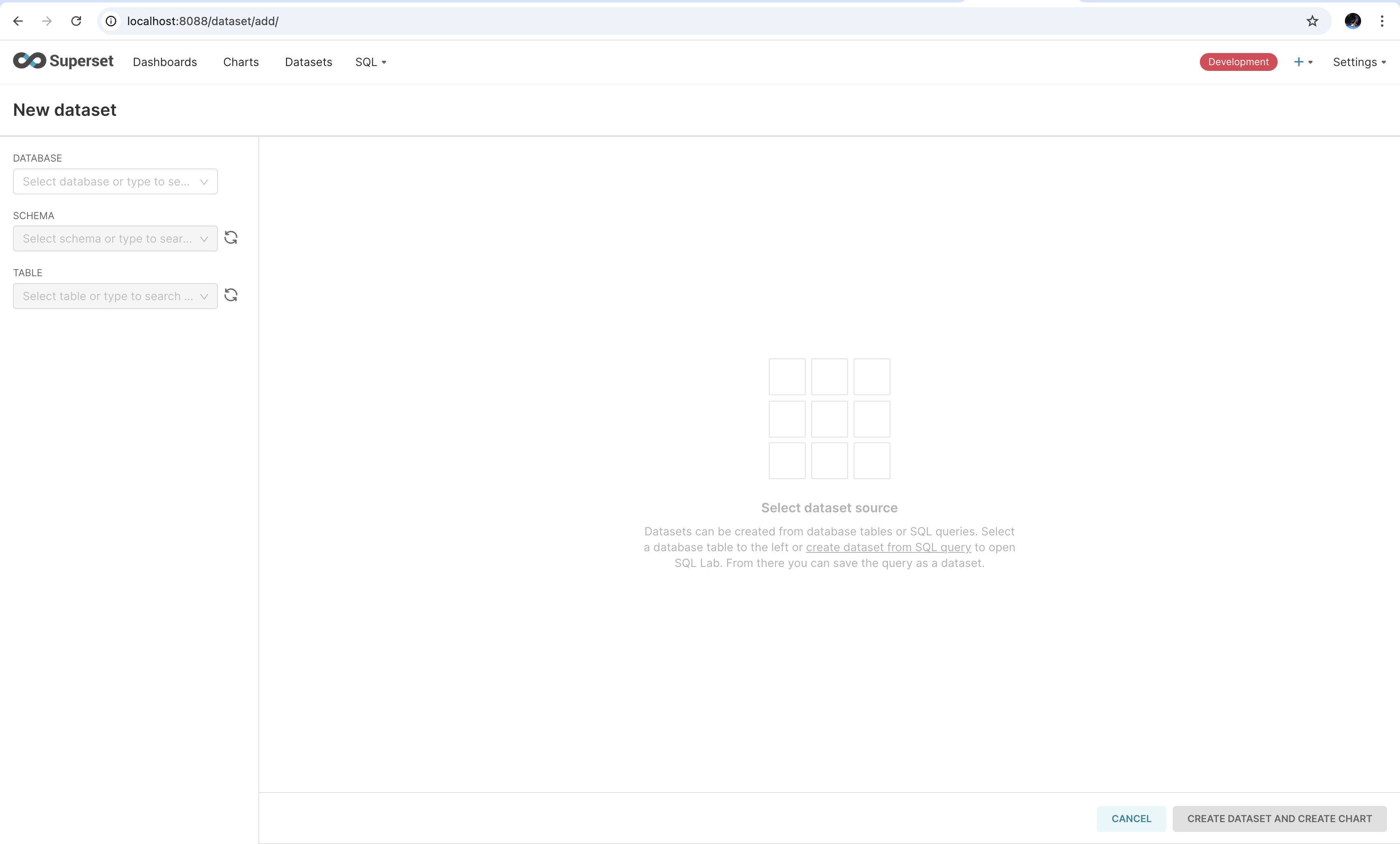
From the drop down on the left, select “Trino” as the database. Select the “views” schema. Finally, select “daily_orders” as the table. Once done, click on “Create Dataset and Create Chart” option on the bottom-right. In the screen that shows, select “Area Chart” and click on “Create New Chart”. This screen is shown below.
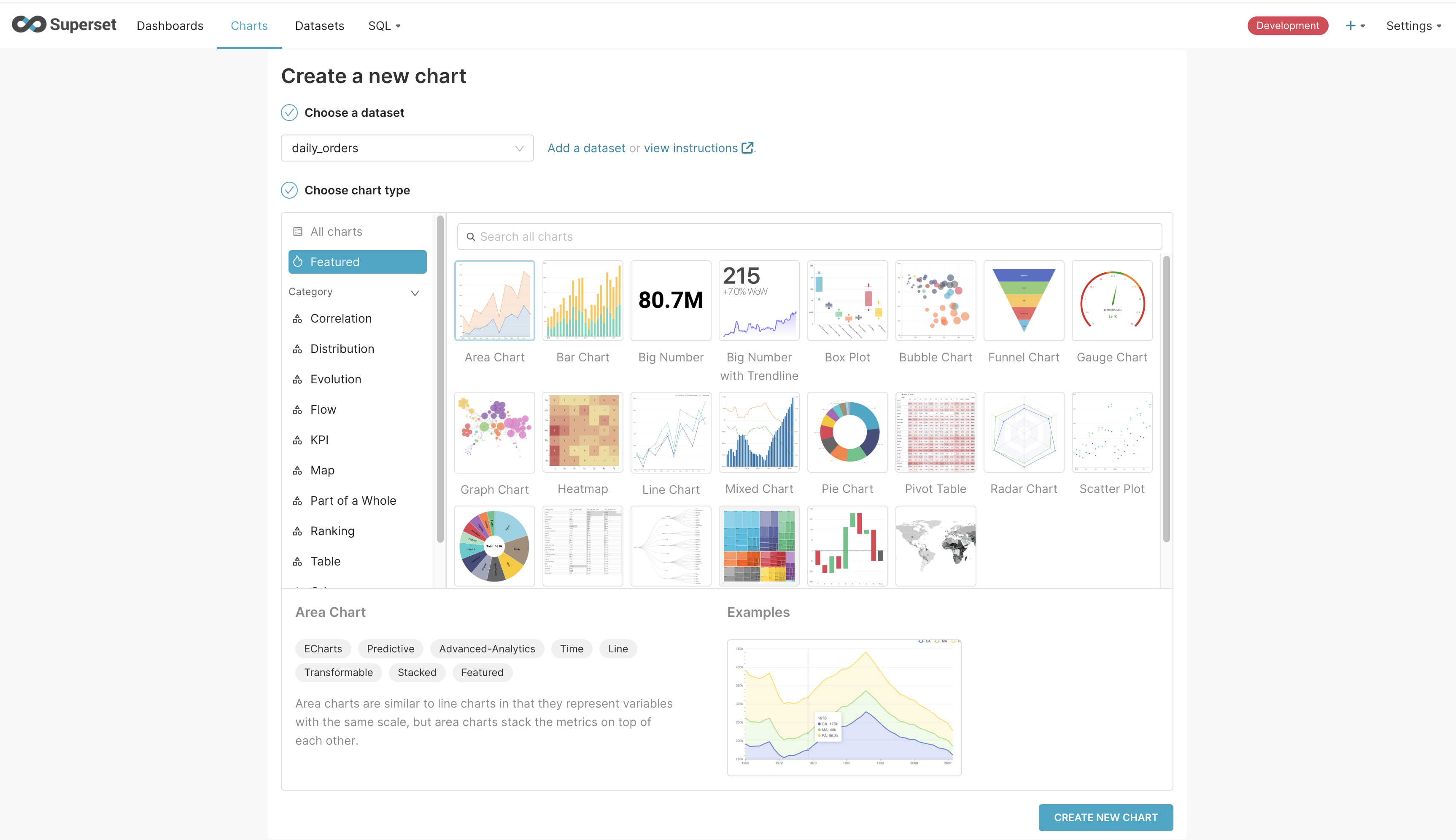
Once on the screen to create the chart, we’ll add the dt column to the X-axis and SUM(pct) to the Y-axis. Since there’s only one value for each day, SUM will return the same value. Clicking on “Update Chart” on the bottom causes a query to be fired to Trino and the result to be rendered as a line chart. It looks as follows.
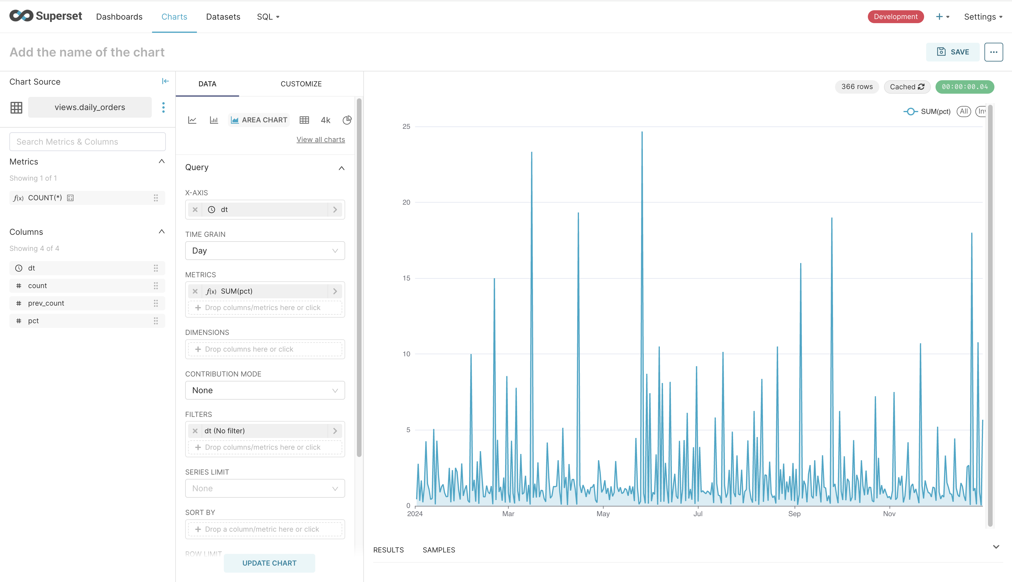
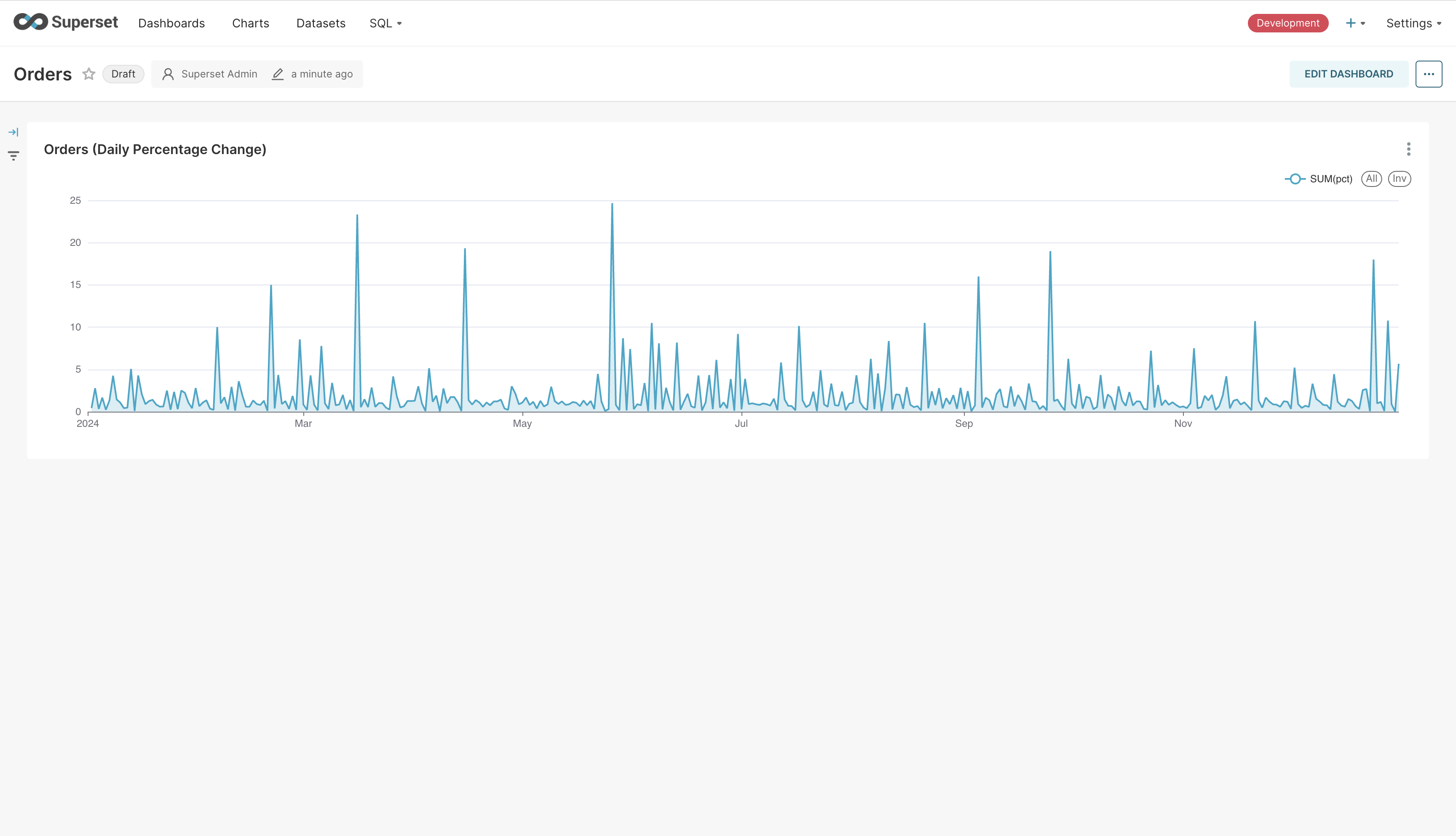
Click on “Save” on the top-right. Give the chart a name and associate it with the dashboard we just created. It’ll take you to the dashboard with the chart rendered in it. Clicking on “Edit Dashboard” will allow you to change the size of the chart. Go ahead and increase its width. Saving the chart will make your dashboard look as follows.
At this point, we can create more datasets and charts. I’ve created two more - one for displaying the data for the line chart as a table, and another for displaying the top customers. My final dashboard looks as follows.
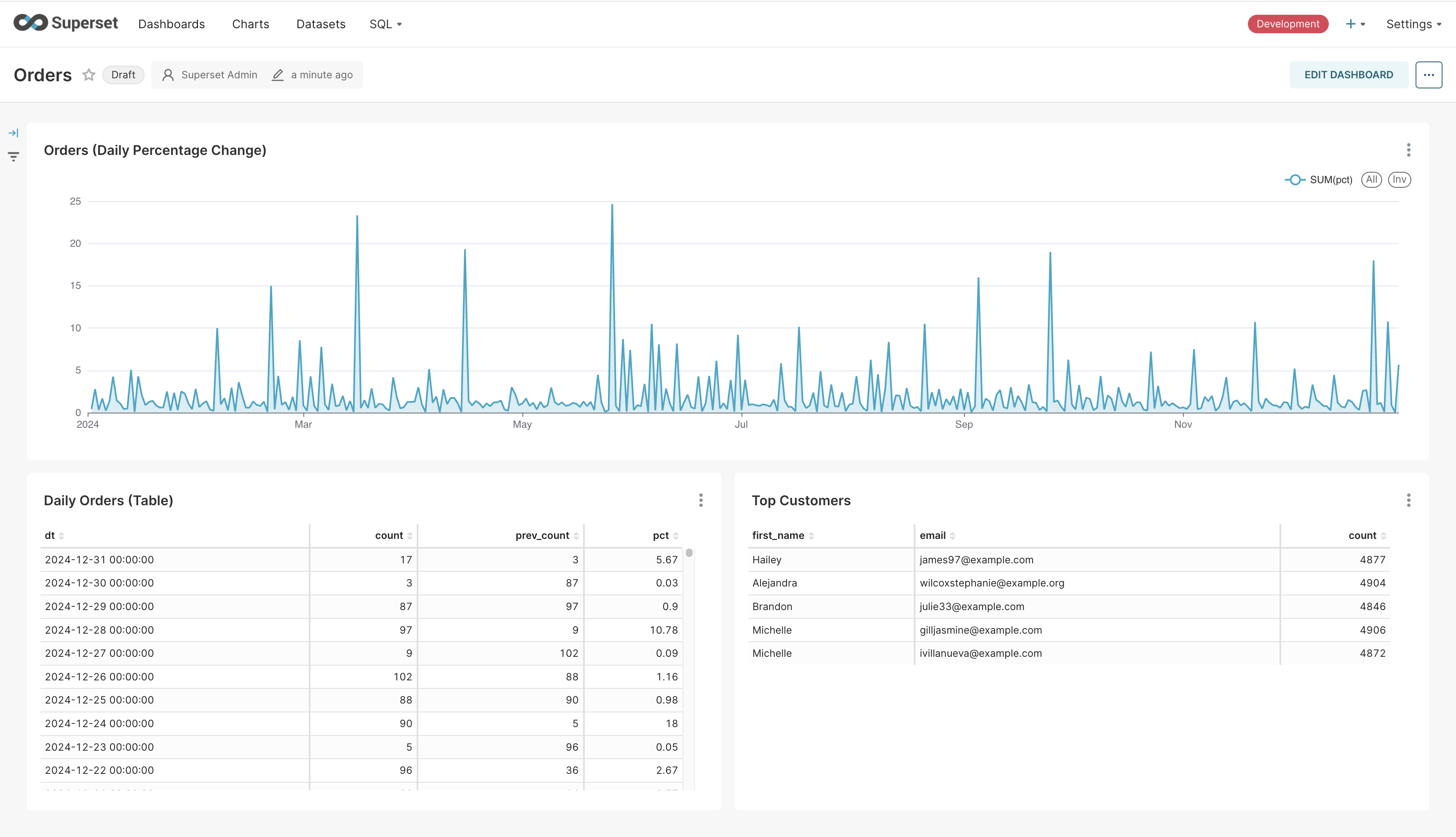
The table and the line-chart are created from a view we’d created on top of Trino. Superset caches the results of the query for faster rendering. We can refresh the charts to see the latest data. Clicking on the three dots on the top-right of any chart will show the “Force refresh” option. Clicking on it will cause Superset to query Trino again to fetch the latest data. Since Pinot is getting updated in realtime and we have a view backing the chart, we’ll get the realtime numbers in the dashboard. We can make this happen automatically. Let’s go ahead and do that.
Click on “Edit dashboard”. Click on the three dots on the top-right and click on “Set auto-refresh interval”. In the pop-up that shows, select a frequency. Click “Save” to save this setting. Click “Save” one more time to save the dashboard. This will make the chart update in realtime without requiring the user to manually refersh it.
That’s it. That’s how you can create realtime dashbord on top of Pinot using Superset and Trino.