Let’s start with an exercise: ask two of your colleagues to create an architecture for a moderately-complex CRUD app. Chances are that they’d look very different from each other. They’d look different because the notations used to depict different parts of the system, like a database, for example, are different. Additionally, everyone has a favorite tool like DrawIO, LucidChart, paper towel, etc. for drawing these diagrams. This approach only works well for rapid prototyping. The drag-and-drop nature of most drawing tools, and paper towel’s susceptibility to getting lost make documenting large software systems a less-than-pleasant experience.
This post describes how to use code to create software architecture diagrams and then commit them to version control. We’ll look at the process and tools for producing consistent diagrams at various abstraction levels, ranging from high-level to low-level. To achieve this, we will create a fictitious notification delivery system. After reading this you should be able to draw diagrams for your own systems at various levels of detail, and be able to explain them to different types of audiences.
In the first part we will talk about why it is necessary to represent the system at various levels of abstraction. In the second part we will talk about notations we can use to draw our system. In the last part we will work through the notification delivery system and create different types of diagrams for it. If you’re looking for an introduction-by-example, feel free to skip to the third part.
Abstraction
Consider a typical software engineering team. You can categorize the people in the team as “engineers” or “not engineers”. Product managers and other stakeholders would make up the “not engineers” portion of the team. They require a broad overview of the system. Within the engineering team, too, people look at the system at different levels of detail. A junior engineer, for example, would focus on the subsystem they are working on while passing by the other subsystems. A more senior engineer, on the other hand, would be expected to be intimately familiar with many systems. This requires presenting the system at different levels of abstraction, depending on the intended audience.
The C4 model allows us to create such views of the system - from the least to the most detailed. The four C’s of the model stand for context, containers, components, and code. A system is made up of many containers (applications, databases, etc), each of which contains multiple components (various API controllers, etc), which are made up of code elements (individual classes, functions, interfaces, etc.). The diagram below, taken from C4 model’s website, shows how they are arranged in a hierarchy.

Given the hierarchy of the four C’s, we can create diagrams at different levels of abstraction. For example, a high-level diagram which only shows different software systems. The highest-level diagram is called the system landscape diagram. This shows how our system fits into the larger scheme of things. The system context diagram narrows the focus by showing our system and the systems that it interacts with. A container diagram adds more detail by showing the responsibilities of different subsystems that together make up our system. Finally, a code diagram shows the most detailed view consisting of class hierarchies, ER diagrams, etc.
Creating such diagrams is helpful because it lets us communicate effectively. For example, we’d use the system landscape or system context diagram when discussing the scope of changes with the product team. A junior engineer, on the other hand, could work their way through the different types of diagrams to get a sense of how the system works.
Writing code to generate these multiple perspectives of the system is a really convenient method, as you’ll see later in the post. All of the views can be generated automatically by the same code. In comparison, you could use a drag-and-drop tool. However, keeping all the diagrams in sync with each other gets tiresome and error-prone.
Notation
Languages like UML are very heavy on notation. For example, the notation to draw a component diagram is very different from a sequence diagram. In contrast, the C4 model is very light on notation. As a starting point, you could represent different diagrams using boxes and arrows, and then augment them with shapes and colors to convey more information. This makes it easy for different people to understand the diagrams without getting bogged down in notation.
As you’ll see in the example that follows, we’ll start with boxes and arrows. For example, the database would be represented as a grey box. We’ll then change it’s shape and color to make it a blue cylinder.
Example
Now let’s look at our notification delivery system. It consists of a REST API which allows callers to send notifications across various channels like email, SMS, or push notifications. Every incoming request is added to a Kafka topic, depending on the channel of delivery, and is eventually picked up by background consumers. The status of each request is updated in the database. A CDC pipeline reads from this database and stores it into a warehouse. The diagram below gives an overview of what the system would look like.

Getting Started
My tool of choice for creating architecture diagrams as code is Structurizr. It provides a DSL which lets us create C4 model of our systems. When you visit its homepage, you’d find an example of how the same code can generate different views of the system at different levels of abstraction. We will use the open-source version of the tool, called Structurizr Lite, which allows a single person to create, edit, and view diagrams; in other words, there is no collaborative editing. The workflow we are aiming for lets individuals submit architecture diagrams as a part of their pull requests. In the next section, we will create a script which will let us run Structurizr Lite as a Docker container. We will then create the diagram that we saw above using the Structurizr DSL.
start.sh
We’ll start by organizing our Git repository. At the top level is the design folder where we will keep all the Structurizr code. The start.sh script, also at the top level, will launch the Docker container and reference the files in the design folder.
1 | . |
The content of the start script is the following:
1 |
|
We pass the name of the file as the first argument when we run the script. It is stored in the /usr/local/structurizr directory of the container which we have mapped to the design folder of our Git repository. When we run the script and the file does not exist, Structurizr creates it for us. This is helpful when we are creating a new diagram. If the file exists, Structurizr will read from it and render the diagrams. Let’s start by creating our first file.
1 | ./start.sh 001-overview |
This will create two files under the design folder. The one we’d like to edit ends with dsl extension and will be committed to the repositiory. It is okay to add the json file to gitignore as that will be generated again when the container runs.
1 | . |
If you navigate to localhost:8080 you’ll see Structurizr rendering a default diagram. We’ll update this to reflect our system.
Creating our first diagram
Open the dsl file with your favorite editor and replace the contents of the file with the following:
1 | workspace { |
Let’s unpack what is going on here. At the top-level is the workspace which is a container for the model and views. A model contains the different pieces of our architecture. This includes the software system we are describing, the people and external systems it interacts with, and the relationships between them. views contains the different levels of abstractions at which we’d like to see the system. Here we’ve defined the system landscape view, and the system context view.
In the model we’ve defined various software systems and the relationships between them. The system that we’d like to diagram is the notificationSystem. At this stage we’ve just added a one-line definition of the system, as softwareSystem, which results in it being rendered as a box in the diagram with its name on it.
We’ll continue to refine this diagram by defining other parts which together comprise the notification system. We will do so by adding them as children of the notification system which we’ve defined in the DSL. In other words, we will add one more level of detail to the system.
Relationships between the different parts of the system are defined using an arrow ->. These can be added as children of a softwareSystem or defined outside of them, as we’ve done above.
Adding more detail
We will now zoom in and add the containers which make up the notification system. We will add the background consumers which consume the notifications enqueued in Kafka and send them to the relevant channel. Update the contents of the dsl file to the following:
1 | workspace { |
Notice that we’ve added components which are children of the notification system. We’ve also changed the relationships to point to these components instead of the parent software system. This keeps the system landscape and the system context diagrams the same but allows us to add a new container diagram to the system. This diagram is shown below.

You can add more detail by creating a component diagram. This will let you show individual parts of your software that perform specific tasks. For example, a REST API controller which handles incoming requests to send notifications. Although possible, it is recommended to add a component diagram only if it adds value. Usually it’d be sufficient to only create a container diagram.
Styling our diagram
The diagram we’ve created so far conveys the architecture. However, the only indication of what is internal to the notification system, i.e. within the scope of the system, is a faint dashed line which groups various components together. Let’s go ahead and style our diagram by making components that are a part of the notification system render with a blue background. We’ll start by creating a few directories under design directory.
1 | mkdir -p design/commons/styles |
We’ve created three directories. styles will contain files which store styling information. icons is where we will keep PNG icons. themes is where we will store predefined themes. This is what the directory structure will look like.
1 | design/ |
Let’s create default.dsl under the styles directory. The contents of the file are given below.
1 | styles { |
Here we are creating a couple of custom elements. We are creating an internal element which has a blue background color, and a database element which is a cylinder. We will then use these elements to style our diagram. Let’s update the dsl file to include these elements. I’m only showing the parts that have changed for the sake of brevity.
1 | workspace { |
We begin by including the styling information using the !include directive under views. Styling information is associated with individual systems and components by using tags. You can combine tags to apply multiple styles. Tags can be specified in-line or as a child of a software system or a component. We’ve specified the internal tag in-line for the api container, and as a child of the db container. Notice how we’ve applied both the internal and database tags to the db container, causing it to be rendered as a blue cylinder. With styling, the container diagram now visually communicates what is within and outside the scope of the notification system.

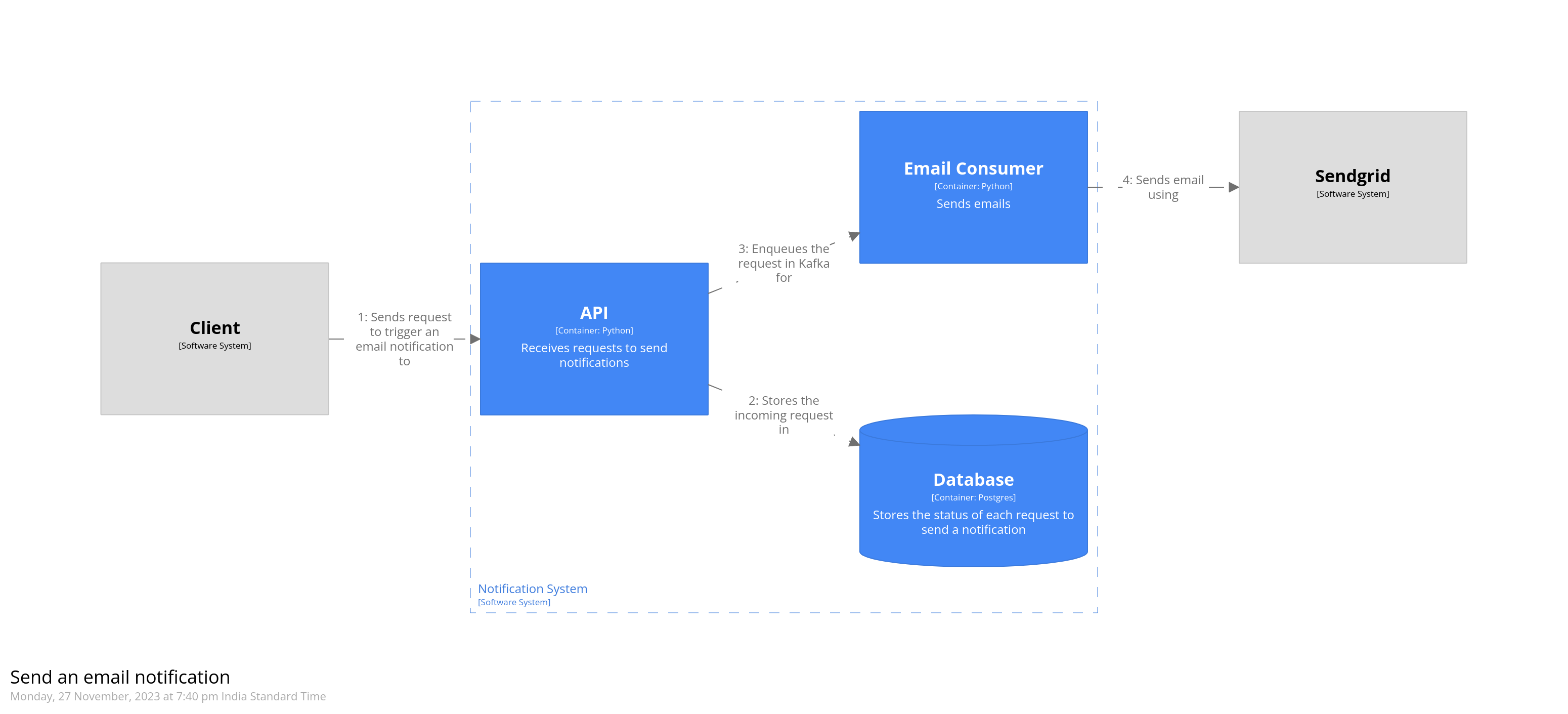
Dynamic diagrams
The diagrams we’ve created so far are static and only show the structure of the system. Dynamic diagrams allow us to show the flow of information between systems as a sequence of steps. They are like UML sequence diagrams but allow a more free-form arrangement of the various parts of the system. The steps are numbered to show the order in which they happen.
As an example, let’s model how an email notification would be triggered. The API receives a request to send an email. It stores this incoming request in the database, and then puts it into a Kafka topic. The consumer then picks up this request, and sends the email using a third-party system.
Dynamic diagrams are created using the dynamic element under views. To model the scenario mentioned above, we’d add the following to our dsl file.
1 | views { |
The steps are written in the order in which they appear. Numbers indicating their sequence are added automatically by Structurizr. The dynamic diagram for the code we just added is given below.
Deployment diagrams
Deployment diagrams allow us to show how the software will actually run. For example, the various components of the software can be deployed as containers running on a Kubernetes cluster. We’ll start by creating a simple deployment diagram which shows the local development environment. All of the services, except the ones that are third-party, will run on the developer’s laptop.
Deployment diagrams are created by adding a model under model using the deploymentEnvironemnt keyword. Once that is defined, we include it in the views. Let’s model the development environment.
1 | model { |
We’re creating a node called “Laptop” which will host all the components running on the developer’s local machine. To this we add the various containers. We add another node to contain all the third-party services. Relationships between these are automatically inferred from the container diagram created previously. Finally, we add it to views
1 | views { |
This gives us the following diagram.

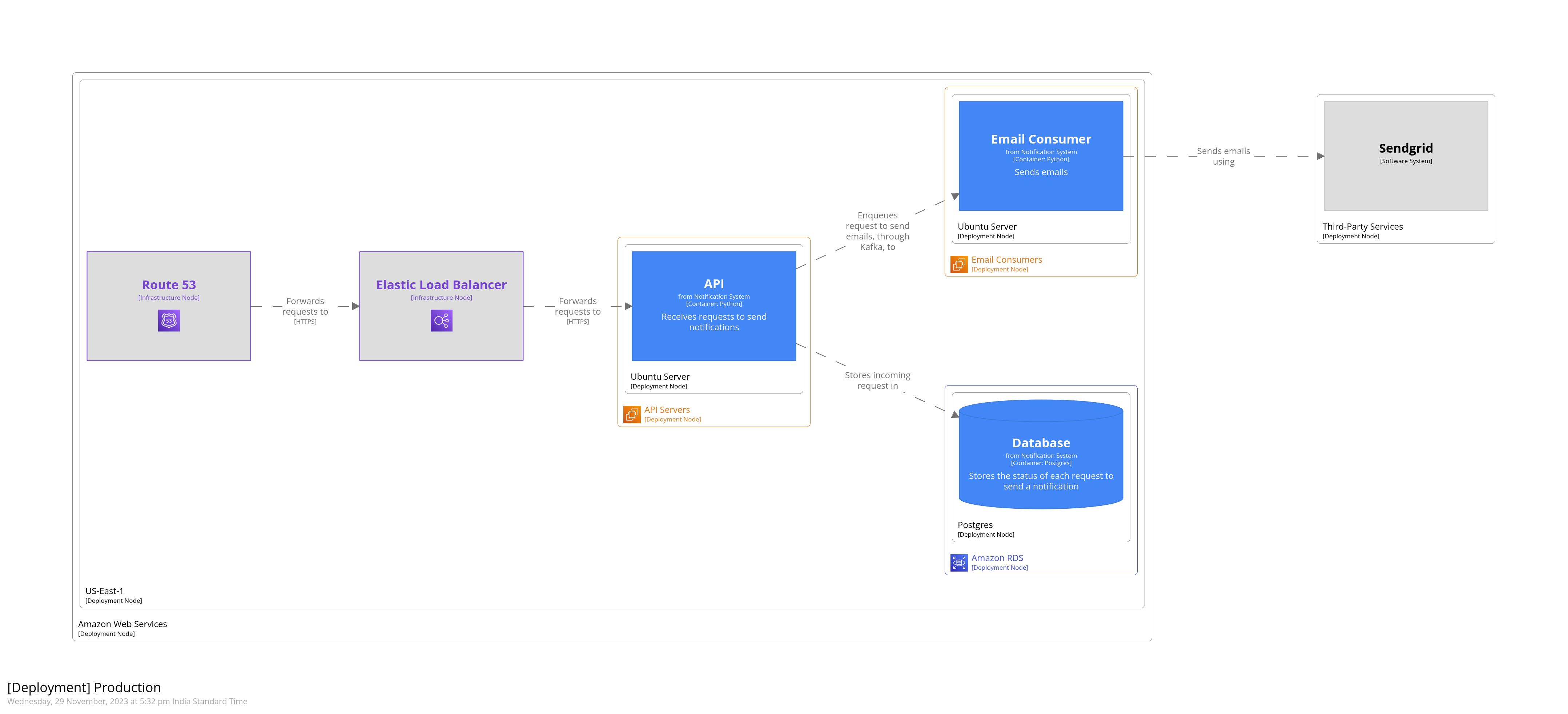
We can also depict how the software would be deployed to production. Let’s say that our system is deployed to AWS. Our databse is an RDS cluster, and API servers and email consumers are deployed to EC2 instances. We use Route52 for DNS, and Elastic Load Balancer to forward requests to the API servers. Like we did for the development environment above, we’ll create a deployment diagram. This diagram, however, will be styled some more to indicate the various AWS services.
Structurizr allows importing themes. Themes provide predefined tags which you can use to style elements of your diagram. Themes are added to views. Let’s start by adding the AWS theme.
1 | views { |
Next we’ll model the production environment. In the model below, we’re nesting deployment nodes. The outermost node represents the AWS environment as a whole. The next node represent the AWS region. Being able to nest deployment nodes allows us to reuse elements of a diagram. For example, if we had multiple database clusters that were all hosted on Amazon RDS, we could nest them all under a single deployment node representing Amazon RDS.
We’ve added Route52 and ELB as infrastructure nodes, and defined relationships between them. They’re styled using tags that we imported from the AWS theme. These are defined in the JSON that’s returned from the theme’s URL.
You don’t need to add relationships between deployment nodes that host your containers. These relationships are implied from the container diagram that was created above.
1 | model { |
Finally, we’ll add the production environment to views.
1 | views { |
This gives us the following diagram. Notice how adding tags has caused AWS icons to be added and styling to be applied, wherever applicable. This is a very small subset of the overall system. Some of the background consumers, CDC, and warehouse have been omitted.
That’s it. That’s how you can create software architecture using code. I’ve created a Github repository for this blog post which contains the complete code for creating the notification system we discussed above.